Problem to Solve
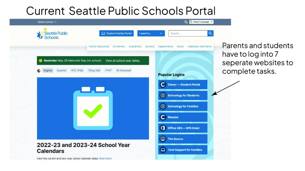
The current Seattle Public School portal system consists of 7 separate websites: Clever, Schoology for Students, Schoology for Families, Seesaw, The Source, Office 365, and Tech Support for Families. This system is confusing and requires logging into and out of all these different sites. A common pain point among all users is feeling unsure of where to go to quickly find what they need. There is a general feeling of disorganization and understanding of what tasks need to be completed.
Our goal was to create one app that would incorporate this whole system of sites into one organized, responsive web application. The portal serves students and their parents as well as teachers and administrators. These users are very diverse and we need to be sure we make our design accessible for a variety of languages, ages, and abilities. How might we organize many tasks and make an easy-to-navigate space for different kinds of users?
Role:
UX/UI Designer, Researcher
Duration:
10 Weeks, Fall Quarter 2023
Team:
Kamy Vu – Duong Cam Vu
Tran – Huang Tuyet Tran Cao
Tools:
Figma
Research
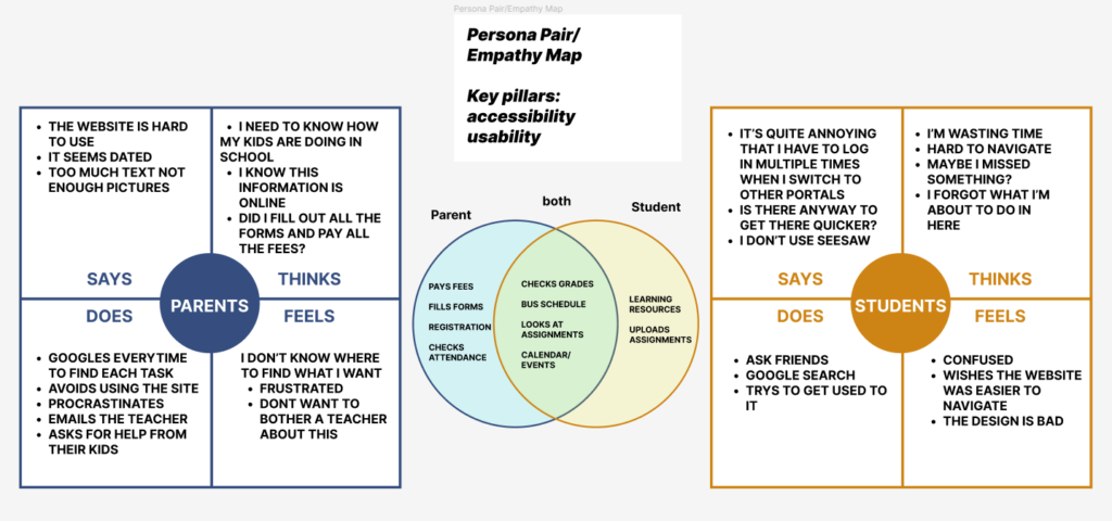
We connected with students and parents and learned about their different uses for and impressions of this system. We listened to their pain points and thought about how we could make things less confusing.
We looked at other school systems such as Canvas and Parent/Student VUE.
We made lists of what tasks a parent would need to complete, that a student would need, and where those needs overlap. We made a list of jobs to be done.
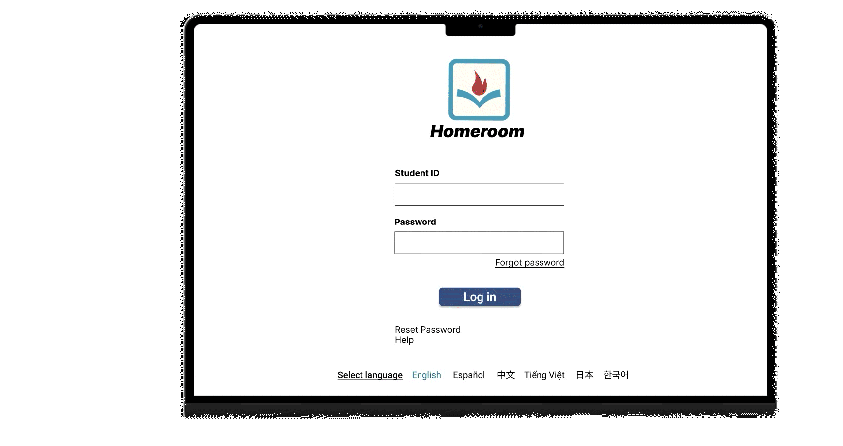
We brainstormed names for our app. Tran created the logo and we chose colors and fonts based on accessibility.
JOBS TO BE DONE
- Class information: assignments, schedule
- Check grades
- Message instructors
- Pay fees and fill out forms
- Check Attendance
- Bus Schedule
- Learning Resources
- Track events and due dates
- Change languages
- Switch between students
our solution
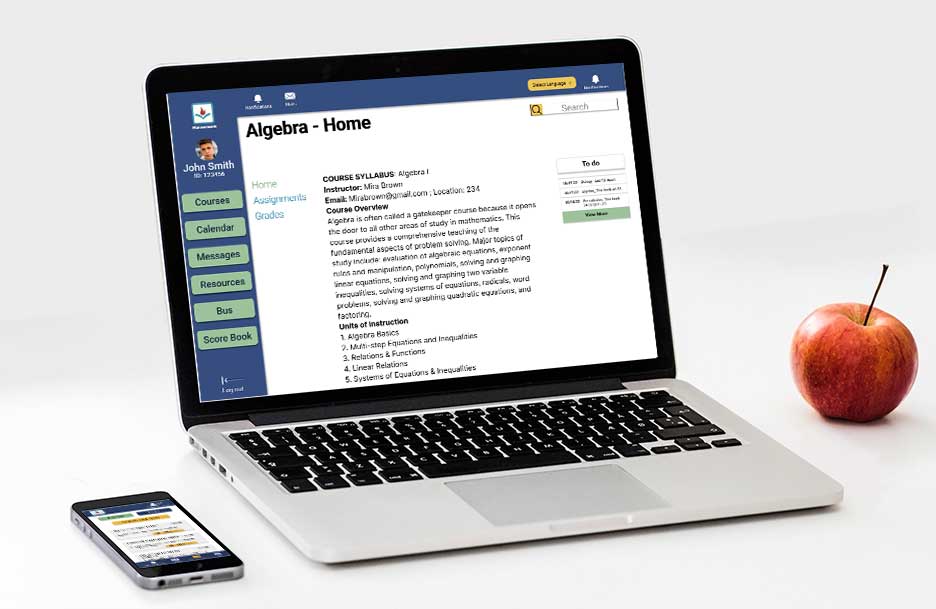
We created a super accessible and inclusive dashboard system to manage classes, homework, and grades.
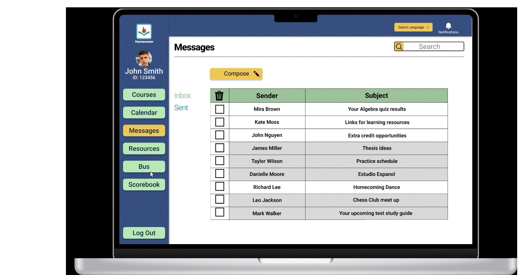
- The scorebook shows all grades together. They are color-coded to show high, satisfactory, and low grades.
- The side panel keeps information easy to find
- click on the square for a day on the calendar and the information is expanded on the right
- Language can be set on the login page as well as on individual pages
- Blue text indicates clickable links
- Status shows an assignment turned in, late assignment and not yet submitted
- Grades are color-coded to show high, satisfactory, and low grades. — indicates this assignment is not yet graded.
- A “To-Do” panel on the right side of these pages shows current tasks so students don’t feel lost
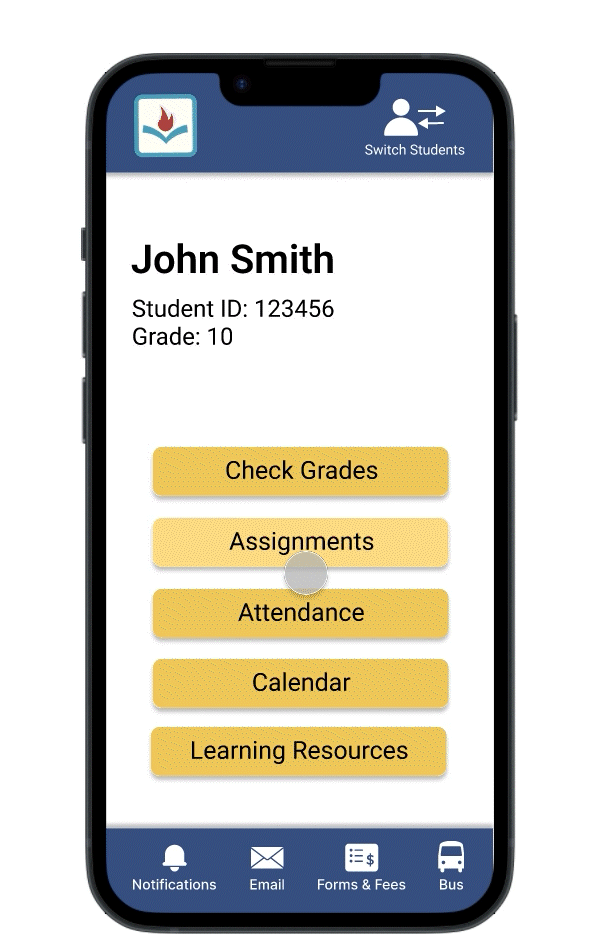
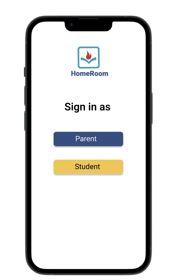
We created some user flows on the mobile version of the app for parents
- We made a switch students link at the top so parents can easily change between children
- the email drop-down is prefilled with instructor names and their classes to make it easier for busy parents
- The calendar is expanded into a list view for easy reading on mobile
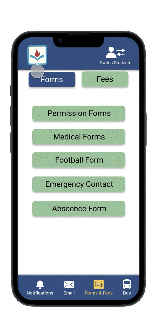
- The forms have placeholder text to make it clear what should be entered
- The logo icon works as a home button
- parents can quickly find everything they need without changing apps
Learning moment
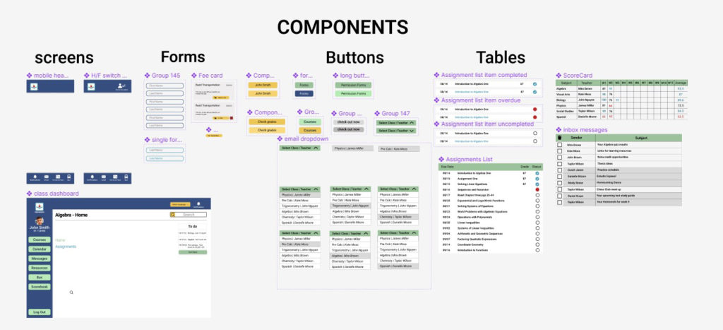
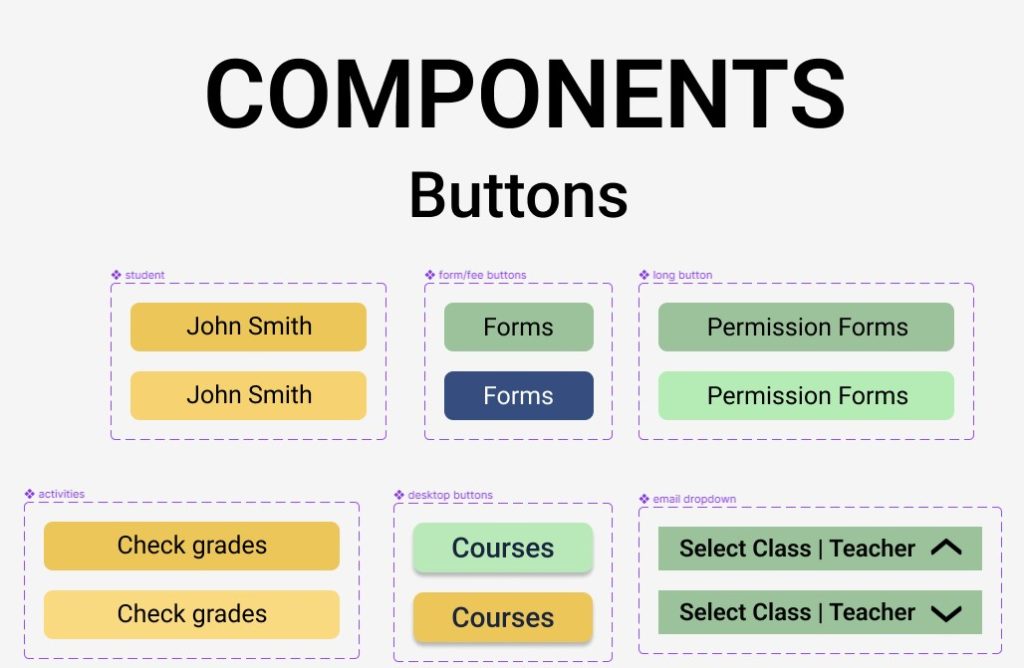
At the beginning of this project, we had all made drawings of what our screens would look like and we divided up the user flows for each of us to create. We thought we were all set to work independently. However, we soon realized that we had made three different-looking apps. We had set up fonts and color systems but we didn’t make a set of components together. This was a learning moment for us. We wanted the app to be consistent on all screens so we created a design system that gave us a unified kit of parts to work with.
I had some of the people I had interviewed at the start try out our solution and they felt like this made everything more organized. I look forward to more opportunities where I can do more testing while building to ensure better products. I enjoy the challenge of creating a complex system for different users that has lots of information but is easy to use.