Green lake Park
Problem to solve
Green Lake is a popular Seattle destination, however, their wayfinding system isn’t clear and could better reflect the needs and sensibility of their current visitors.
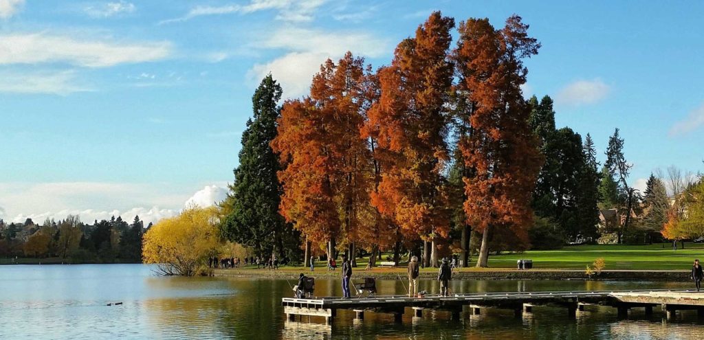
Green Lake Park has been a popular recreation destination in Seattle for over one hundred years and serves people of all ages and backgrounds. It stands out among other parks in Seattle because of its scenic lake and the path for walkers, joggers, and rollerbladers around the lake’s periphery. Visitors can partake in a number of recreational activities such as swimming, fishing, and boating.
The goal of this project was to create a clear and cohesive system of wayfinding that is updated and accessible to a wide demographic of current visitors.
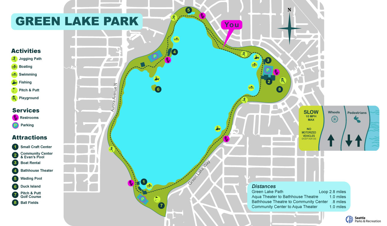
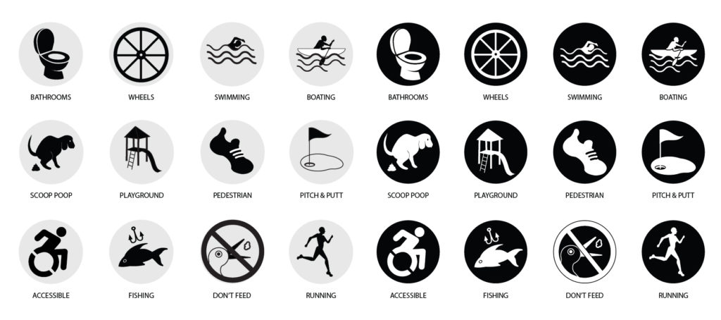
The bathroom icon is a toilet instead of the current male/female icons that don’t reflect our current understanding of gender fluidity.
This redesign is centered around the current visitors of Green Lake and what activities they enjoy with colors and icons that are contemporary. The theme of water joins the many parts of this system and focuses on the most important feature of this space.
Role
Art Direction, Layout, Wayfinding, Environmental, and Experiential Design
Duration
10 weeks, Winter quarter 2023
Team
Solo project
Tools
InDesign, Photoshop, Illustrator, Procreate
Discovery
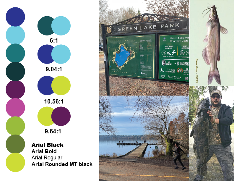
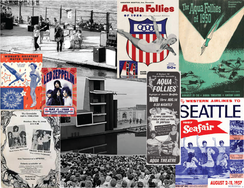
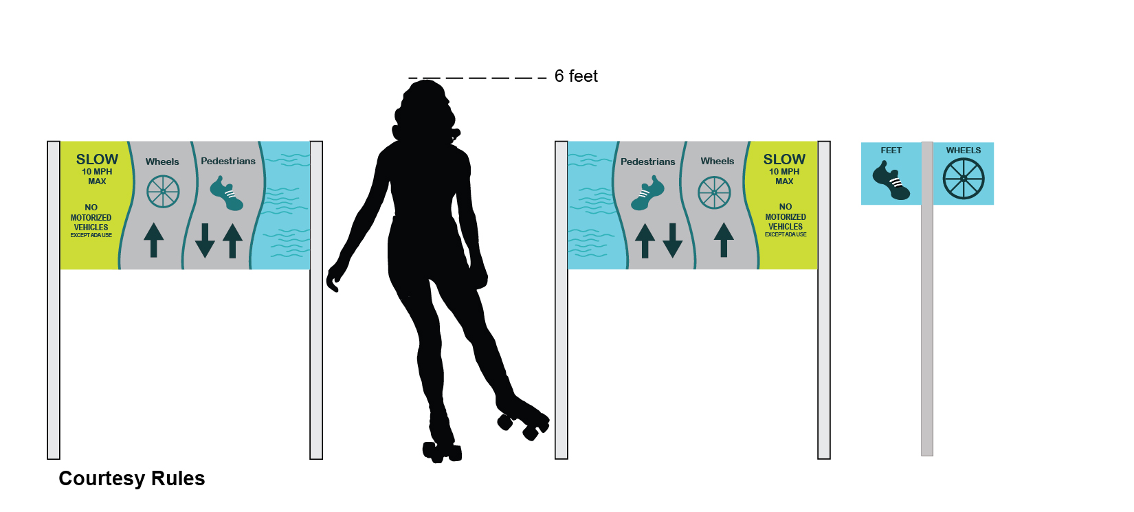
My first step was to visit Green Lake Park to look at the current signage and visitors. There is a path around the lake with one side for wheeled traffic without motors ( roller bladers, wheelchairs, strollers, etc.) and the other side has foot traffic. This path is used by many people and the signage helps communicate these traffic guidelines. The park hosts lots of activities like boating, swimming, and even miniature golf. Despite having lived more than half my life in Seattle I found so much I did not know in my research of this historic place. Green Lake’s aqua theater initially hosted various performances from synchronized swimmers and then later rock bands like Led Zeppelin. I learned about the fish that live in Green Lake and some of the people that fish there. How might I improve on the current wayfinding and make a system that would work for years to come? My color system is primarily blues and green to represent the water and other natural features with a pop of magenta to call attention. The current map being mostly green blends into the view and may be hard to find. I chose high-contrast color combinations and font choices that center around accessibility.
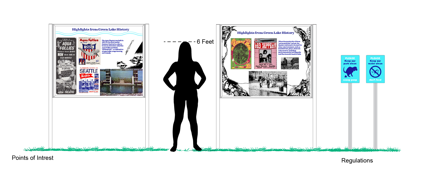
My point of interest sign focuses on the topic of the Aqua Theater and some highlights from its history. The Aqua Theater served as an affordable entertainment venue that brought communities together. I think displaying this fun part of Seattle’s history may get people thinking about doing something like this again. I did not know about this before embarking on this project and I have lived in Seattle for over 30 years! This sign will spark further exploration and interest in Seattle’s evolving culture.
family of icons
Placemaking
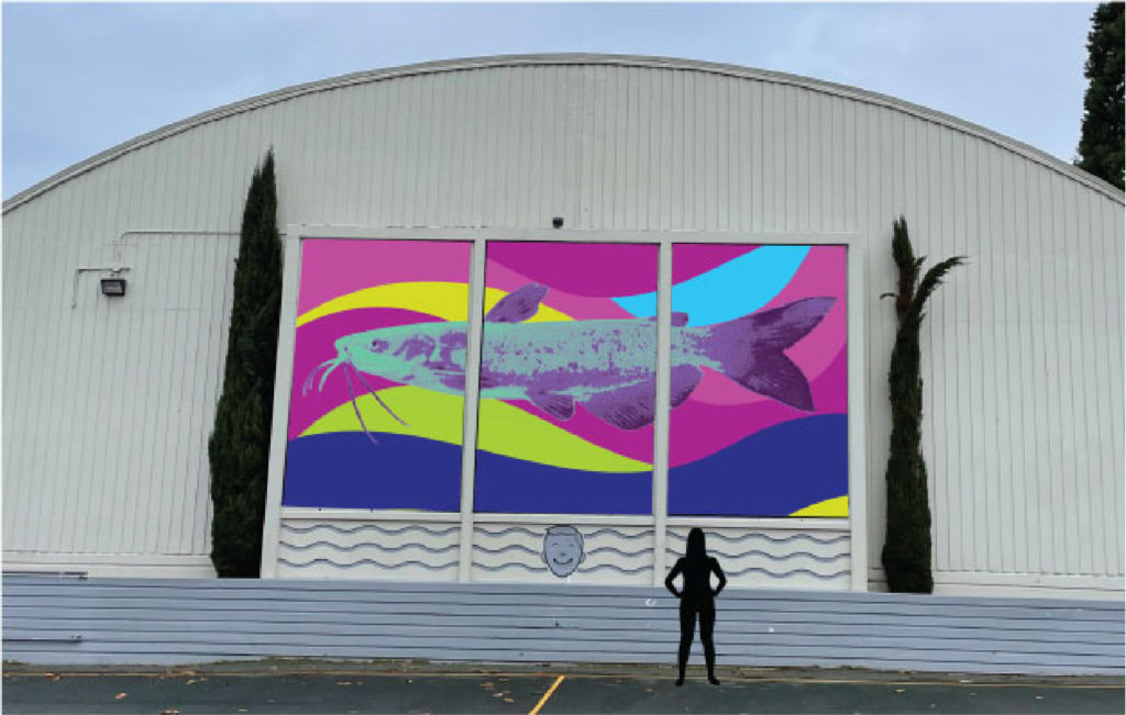
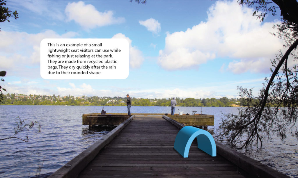
Public art
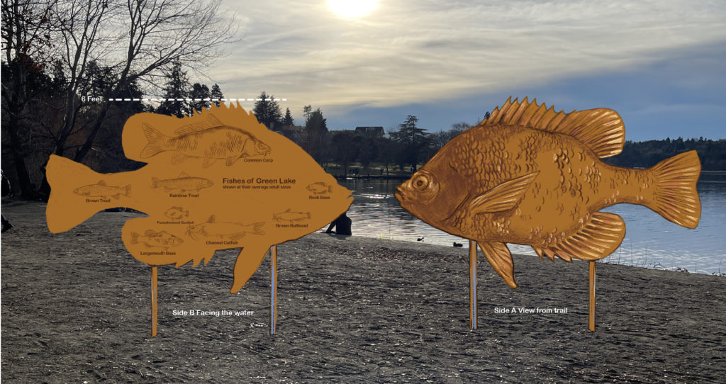
My proposed public art for this project is a large bronze fish sculpture. This is a fun way of showing the fishes of Green Lake. This is a Pumpkinseed Sunfish on the side facing the path. On the other side facing the water are low-relief sculptures of the other common fishes in Green Lake at their average adult size. Green Lake is stocked with Trout every year, it is a great place to fish!