Project Goals
Why I chose this project
As a long-time instructor at Pratt, I care a lot about this nonprofit organization and I want them to be successful. I chose this task because I wanted to improve Pratt’s mobile website and improve my skills in UX/UI design. I am interested in a career change to UX/UX design and I want to work on a real-world project to try out this career path while improving my skills. This venture was made with Figma and helped me improve my skills using this tool and conducting user testing. Figma allows me to create realistic prototypes that I mirrored on my phone to facilitate user testing and refine my design.
Pratt has had big staffing changes over these past pandemic years and when speaking with Pascha ( the new marketing manager ) I found out that they had paid a design firm to go through a few iterations to improve Pratt’s website. However, after three rounds with Milli’s design team, the project was tabled because a few of the Pratt staff members heading this project moved on. Pratt is now about to hire a new executive director and will most likely do a website redesign as a way of introducing the new leadership and also refreshing after COVID. So not only would this be a problem I want to solve, but this work could also possibly be implemented in the real world!
The Challenge
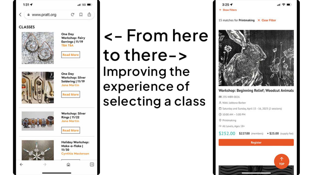
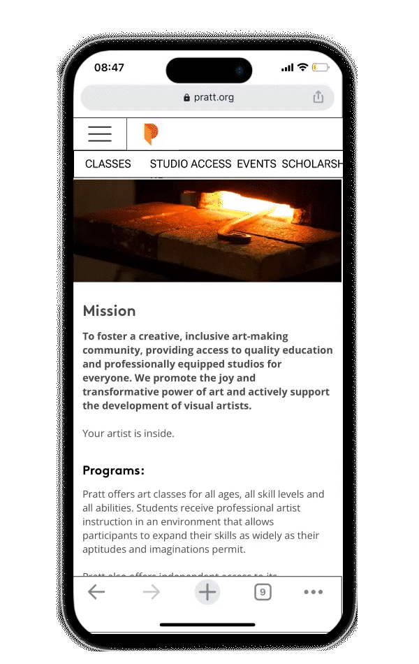
Pratt Fine Art Center needs an improved mobile experience for people wanting to register for classes based on their schedules and interests. Pratt offers a wide range of excellent classes but its current mobile interface is frustrating to use. Pratt offers classes in many different disciplines (woodworking, glass, sculpture, printmaking, etc.) so its website must hold a lot of information. The classes that are offered are all hands-on activities that do not require and rarely involve the use of a computer. I think many people who are interested in taking classes will want to use their phones to register for classes. It is very important that picking a class is fast and easy on the mobile view of the website.
The Process
First I looked over what Milli’s design team had done. I did not want to repeat their work and if I thought they had resolved all the issues I should find another project. I liked some of what they did such as modifying the existing site colors and font sizes to make the site more accessible and I kept these things.
I did some user testing right away with the existing site to see how people who had never used the site experienced it. They showed me things I missed because I am so familiar with the site. I thought a lot about how one would pick out a class – what would be a person’s thought process?
The Process
Initial user testing
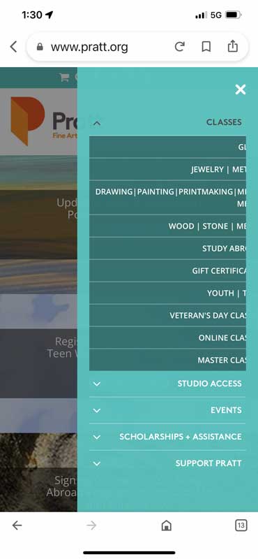
- Users had to scroll down to see the class listings
- Some COVID information was outdated or just didn’t make sense.
- Transparent pop up is hard to read
- You need a calendar to figure out what day of the week classes are on
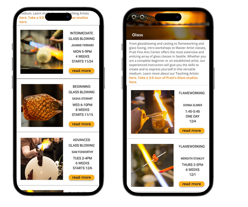
- No class length listed
- Users chose classes based on images for class listings
- Check out process is confusing
- No option to sign up for an account
- Hard to find a specific class
- Must scroll and load several pages to find classes
My Solution
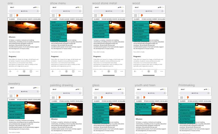
- Improved navigation system
- Classes listed by the material used
- Materials are broken down into specific processes
- Printmaking separated from painting and drawing
- Youth and Teen classes moved to Material listings
- Added weekday to card
- Added class time
- Added class length
- Made images larger
Conclusion
More Testing: Pratt Employees
- Add a section at the bottom “classes normally offered”
- Larger type: “I can read it now!”
- “People can find my class now”
Pratt implemented the changes I suggested!
- I improved my Figma skills and speed
- User experience problem-solving is satisfying
- User testing is vital to catching issues
- Improving usability helps everyone